1. Flowcharts
As an "old school" computer program, flowcharts are a tool with which I have been intimately familiar. Flowcharts are a great tool for teaching mathematics because most of mathematics involves breaking a big problem into smaller problems to be solved. Often times when working through a new concept, I will introduce the concept pieces at a time before putting it all together. For example, when doing an Algebra unit on the Quadratic Equation, the first lesson will likely be putting an equation in standard form (box 1 of the flowchart) and identifying the A, B, and C values (box 2). One of the last steps would be using the value of the discriminant (b^2 - 4ac) to evaluate the type and number of solutions for the given quadratic equation.
2. Gantt Chart
A Gantt Chart is often used in project management to provide a visual representation of the tasks involved in a larger project. The Gantt chart is useful because it shows a linear progression of all the mini-tasks included in the project. It shows the amount of time required for each task, the interdependency among tasks, and tasks which are independent of one another.
In math class, a Gantt Chart could be used to show the students the course "map" throughout the year. A Gantt Chart could be created for each individual chapter of the book. A global Gantt Chart could be created to show the overall plan for the course. Periodically throughout the year, the Gantt Chart could be referenced to show the students "how far we have come" so far in the course.
3. Wordle
Wordle is a data visualization tool which will generate "word clouds" from a block of text generated by the user. Words which are used more frequently are shown more prominently in the word cloud, usually meaning that they are shown in larger font. Wordle encourages creativity by allowing the user to specify different fonts, color schemes, and layouts. It is easy to learn, quick to create a new image, and fun!
In mathematics class, wordle could be used in a similar way to a "Word Wall" to summarize the concepts studied in a chapter or within a course. It provides students a great visual reminder of the most important concepts within the unit.
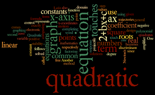
Here is an example of a Wordle Chart created from the Wikipedia page on the Quadratic Formula:

4. Venn Chart (Diagram)
A Venn Chart, often also known as a Venn Diagram, shows logical relationships between a collection of related things. The relationships are pictured by creating a set of overlapping closed circles and including the property in the appropriate circle(s).
A great example in mathematics would be to create a Venn Diagram with three circles: even numbers, odd numbers, and prime numbers. Then, have the students go through an exercise using the numbers 1 through 30 and placing each number in the appropriate place in the Venn Diagram.
A completed Venn Diagram gives an overall picture of the relations in the original collection of objects.
5. Interactive History Timeline
An Interactive History Timeline like the one highlighted here gives a "big picture" of the history of a specific topic and allows the user to zoom in for more detail on specific topics. Though I would not envision this being used extensively in mathematics, I see where it could be useful in studying a survey of the history of mathematics.

Interesting you should mention Wordle this week, Doug - it can be used to find the mode(s) and to display them beautifully.
ReplyDeleteI like flow charts a lot, as well. There is good free software for making them, which students can use. The last one I used and liked was http://www.lucidchart.com/